House of Needlework

Full Brand Design Guideline
Project Overview
Year: 2025
Services: Brand Identity, Visual Identity, Brand Guidelines, Print Collateral
Visit Site
My Contributions
As part of my apprenticeship at Tille’s / House of Needlework, I had the opportunity to build the visual identity for House of Needlework from the ground up. I was given a lot of creative freedom, with the main brief being to create an international brand with clear roots in Danish design and culture.

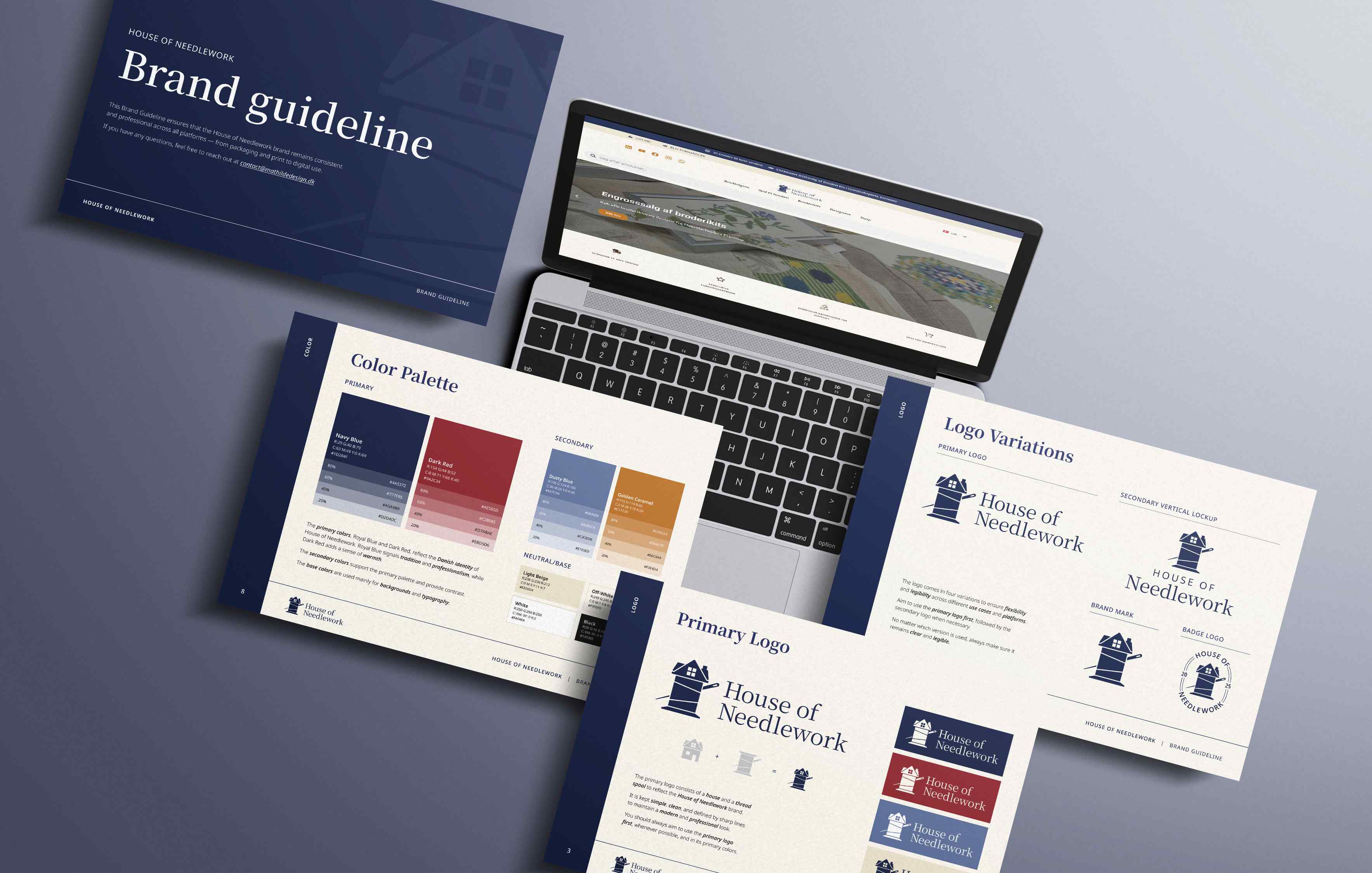
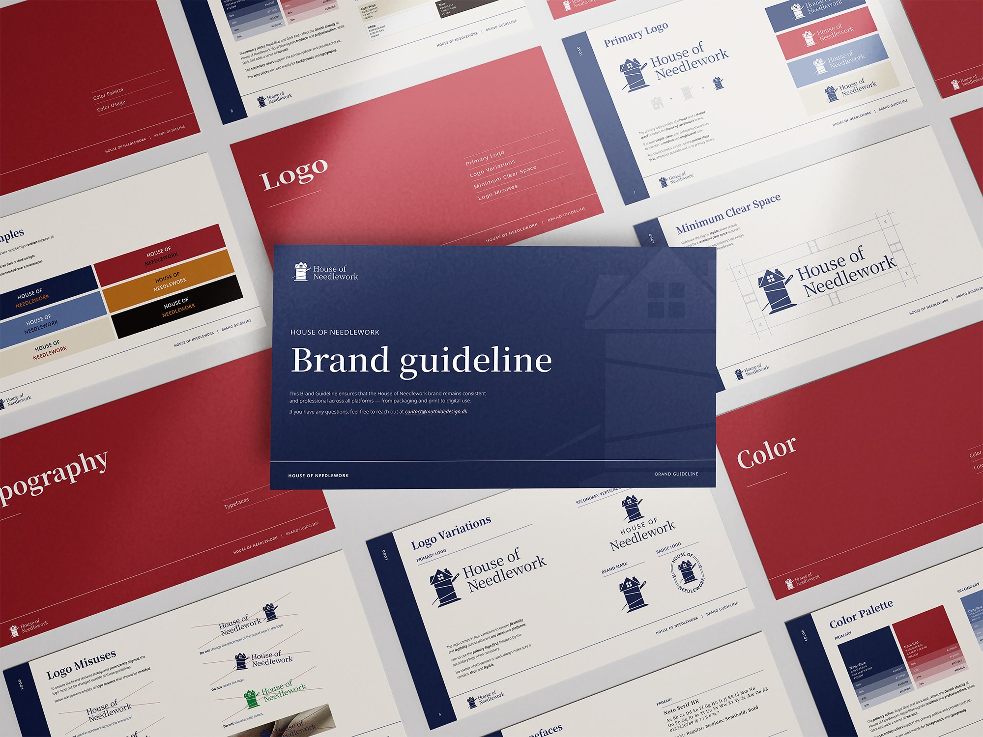
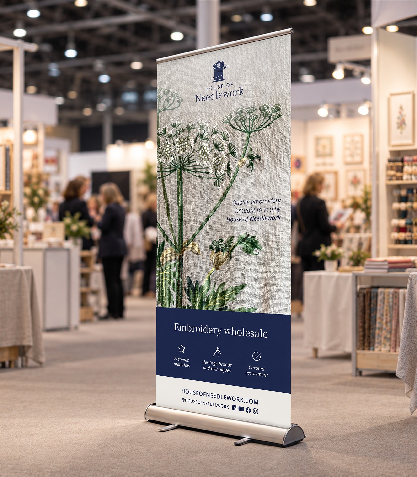
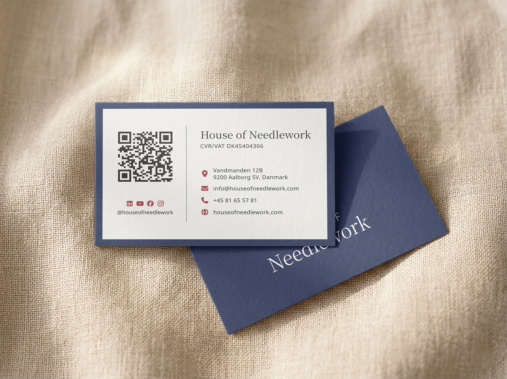
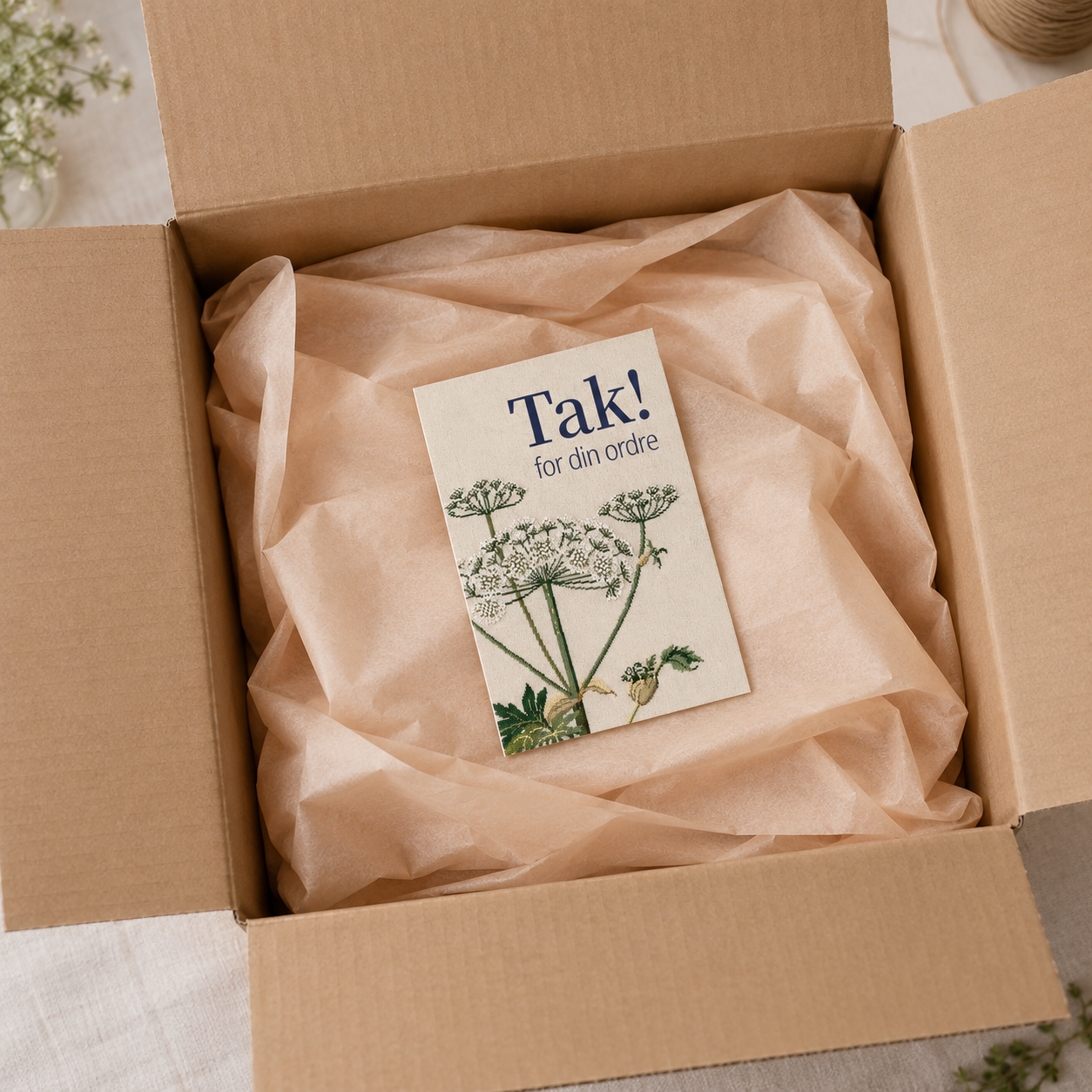
I developed the full identity, including the logo, colour palette, typography, graphic elements and brand guidelines. I also worked on bringing the identity into real-world applications, including business cards, roll-ups and other printed materials.

From the first moodboards and logo sketches to the final design system, I was responsible for developing the visual direction and making sure the brand could work consistently across different formats and markets.
Programs
Figma
Adobe Illustrator
Adobe Photoshop
House of Needlework works with retailers across Europe as well as markets such as the US, Japan and Australia. Because of this, the identity needed to feel international while still having a clear connection to Denmark and the Danish needlework tradition.

I started the process by exploring three different directions through moodboards and early logo ideas. Each concept approached the Danish connection and the world of needlework differently – from something soft and handmade to a more established and professional expression.

This gave us three quite different starting points to discuss before choosing which direction to develop further.
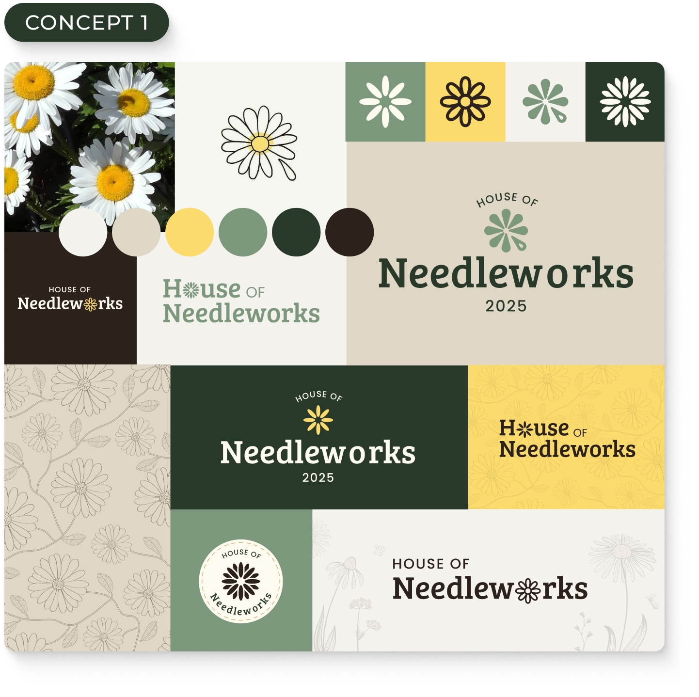
Concept 1 – The daisy
This concept was built around the daisy, Denmark’s national flower, and had the softest and most playful expression of the three. I explored how the flower could become part of the logo itself, including the idea of turning one of the petals into a needle.

The muted greens, warm yellow and natural tones were chosen to give the brand a friendly, creative and slightly more feminine feel, with a clear connection to craft and nature.
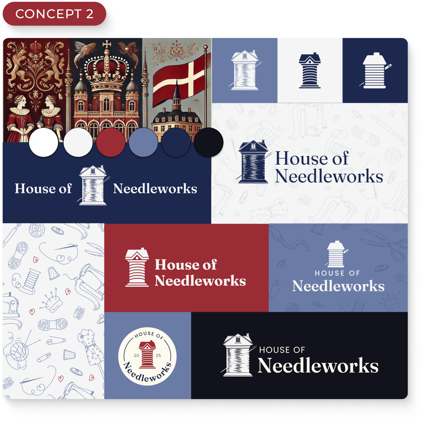
Concept 2 – The house and spool
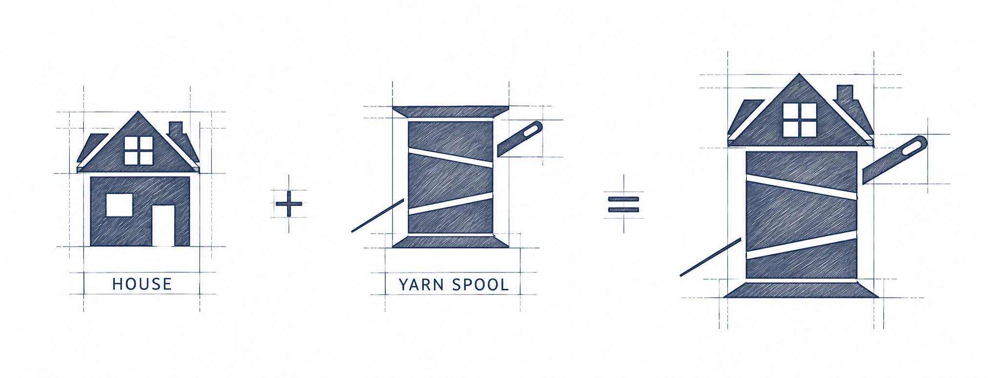
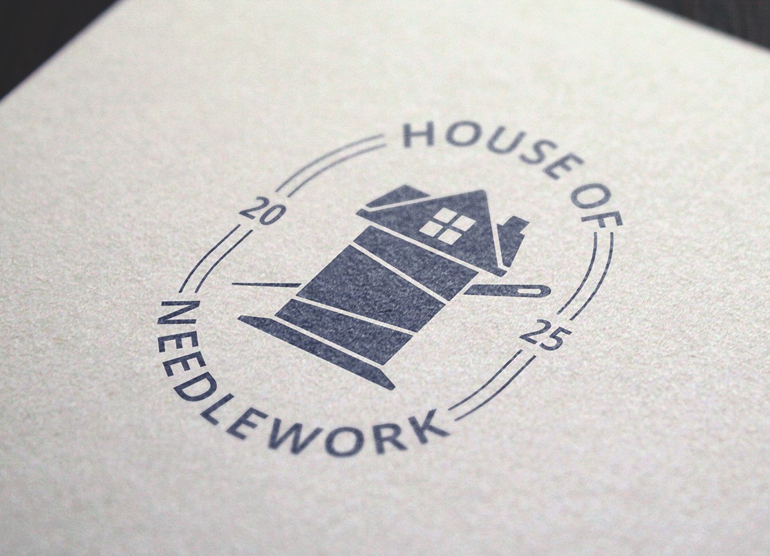
For the second concept, I took a more literal approach to the House of Needlework name. I combined the shape of a house with a spool of thread, creating a symbol that connects the company name directly with its connection to needlework.

The colour palette was inspired by Denmark, using red alongside deep royal blues. Compared with the first direction, this concept was designed to feel more established and professional while still keeping a traditional, handcrafted character.
Concept 3 – Thread & Typography
The third direction focused more on typography. Instead of creating a separate symbol, I explored how thread and needlework could become part of the lettering itself, using flowing lines and details inspired by thread.

The blue palette was influenced by traditional Danish design, including the recognisable blues associated with Royal Copenhagen. This resulted in a lighter and more elegant direction, with the typography doing most of the work.
Final design
After presenting the three concepts, we decided to move forward with Concept 2. The combination of the house and spool connected naturally to the House of Needlework name, while the overall expression suited both the company and the international B2B audience.

From there, I refined the logo, proportions, typography and colour palette and developed several logo variations to make sure the identity would work across different sizes and applications.

The finished identity was brought together in a complete brand guideline covering the logo system, colours, typography and supporting visual elements. I then applied the new identity across physical materials such as business cards and roll-ups, creating a flexible system that could continue to grow with the brand.

Want to get in Touch?

Let's bring your vision to life! Whether you have a project in mind, need a quote, or just want to chat, I'm here to help!

Thank you! Your submission has been received!
Oops! Something went wrong while submitting the form.